

Table of contents
- What is Flexbox?
- Flex Box Architecture
- Basic Properties
- Without Flexbox
- Display
- flex-direction
- flex-direction:row
- flex-direction: row-reverse
- flex-direction: column
- flex-direction: column-reverse
- flex-wrap
- flex-wrap: nowrap
- flex-wrap: wrap
- flex-wrap: wrap-reverse
- flex-flow
- justified-content
- justified-content: flex-start
- justified-content: flex-end
- justified-content: center
- justified-content: space-around
- align-items
- align-items: stretch
- align-items: flex-start
- align-items: flex-end
- align-items: center:
- align-content
- align-content: stretch
- align-content: flex-start
- align-content: flex-end
- align-content: center
- align-content: space-between
- align-content: space-around
What is Flexbox?
Flexbox is a box model specification defined by w3.org The Flexbox model allows us to layout the content of our website. It also helps to create a responsive website for both large screen devices and small screen devices.
Features of Flexbox -
No Floats.
Responsive and Mobile Friendly.
Positioning Child Elements is Much Easier.
Flex Container's margin does not collapse with the margin of its contents.
Order of Contents can be easily changed without editing the source HTML.
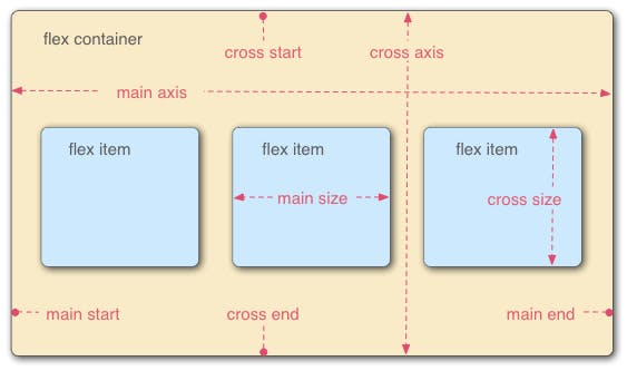
Flex Box Architecture
So how does Flexbox architecture work? The Items are generally positioned along the main axis and cross axis. And, based on the flex-direction property, the position changes between rows and columns. In the flexbox, there are mainly two items: a parent container (the flex container) and the immediate children elements of the parent.
Basic Properties
displayflex-directionflex-wrapflex-flowjustify-contentalign-itemsalign-content
Without Flexbox
Display
First, we have the display property. It is what defines the flexbox container and it is compulsory while working with flexbox.
flex-direction
flex-direction defines the direction of the items that are to be placed in the container. we can also change the value of the flex direction depending on the design. it accepts four values -
row
row-reverse
column
column-reverse
flex-direction:row
It is the default value of the flex direction. It is generally placed on the main axis which is from left to right. There are no changes by default.
flex-direction: row-reverse
in row-reverse the main axis is from right to left. as a result the items will be now placed from right to left of the container. Let's see an example below.
flex-direction: column
when we change the flex-direction to the column, the main axis changes its position from top to bottom. Now, the items will be stacked from top to bottom.
flex-direction: column-reverse
Next, we have is column-reverse. It stacks the items in reverse order. Look at the example below. you can see that image 1 is at the bottom while image 3 is at the top.
flex-wrap
It is used to wrap the items inside the container. if the browser width is reduced, we generally lose some items for the browser width. This behavior changes with the flex-wrap property. It can accept three possible values:
- nowrap (default value)
- wrap
- wrap-reverse
flex-wrap: nowrap
it is the default value of flex-wrap. If we set the property value to nowrap, there are no changes in the alignment. See the example below.
flex-wrap: wrap
When we set the flex-wrap property to wrap and if we reduce the width of the browser, we can see that the items are automatically wrapped in the container.
flex-wrap: wrap-reverse
Here, it pushes the last item to the top instead of the bottom of the container.
flex-flow
It is the combination of flex-direction and flex-wrap. In flex-flow, the first value is for flex-direction and the second value is for flex-wrap.
justified-content
It defines the position of the flex items along the main axis. values of the justified content property are given below-
- flex-start
- flex-end
- center
- space-between
- space-around
- space-evenly
justified-content: flex-start
If we set the value to flex-start, it keeps the items at the start of the main axis which is from left to right.
justified-content: flex-end
The items are placed at the end of the main axis ie. at the right of the container:
justified-content: center
The flex items are aligned at the center.
### justified-content: space-between it helps to split extra space evenly and add it in between the flex items:
justified-content: space-around
The extra space is distributed along the flex items. It also adds space before the 1st item and after the last item in the container.
align-items
The align-items property defines how the flex items are positioned out along the cross axis ie. from top to bottom.
- align-items: stretch
- align-items: flex-start
- align-items: flex-end
- align-items: center
align-items: stretch
The items are stretched across the whole cross axis. The cross axis is from top to bottom by default which means the items will fill up the whole space.
align-items: flex-start
It is the starting point of the cross axis. The cross axis is from top to bottom which means the flexbox items will be aligned vertically from top to bottom.
align-items: flex-end
It pushes the items to the end of the cross axis of the container:
align-items: center:
The items are positioned at the center along the cross axis.
align-content
It is similar to justify-content with the only difference being that it will align along the cross axis instead of the main axis. It only applies if the flex-wrap properties are present.
- align-content: stretch
- align-content: flex-start
- align-content: flex-end
- align-content: center
- align-content: space-between
- align-content: space-around
align-content: stretch
It specifies the default position for items inside the flexible container. It has no effect on alignment.
align-content: flex-start
It pushes the items to the start of the cross axis:
align-content: flex-end
it pushes the items to the end of the cross axis:
align-content: center
It pushes the items to the center of the cross axis.
align-content: space-between
It takes all the extra space of the container and put it between the lines.
align-content: space-around
This distributes the space around the lines:
This was all about Flexbox. Thanks for reading.